UPDATE: We had a online meeting with the Product Lead at Google Maps to present the embedded Google map accessibility issues. There's currently no estimate on when issues will be resolved.
Organisations often rely on embedded content to add additional functionality to their websites. It's incredibly easy to share a YouTube video or Google map, and embed that video on your own website using HTML that is automatically generated.
For YouTube videos, it means not having to host the content on your own website, which can speed up loading times and save your storage space, and for Google maps, it means not having to go through the pain of installing a map plugin onto your website.
Embedding HTML via an iframe does however mean that you cannot customise the code, which can lead to complications if that embed code has accessibility issues that may impact your audience.
For this article, we'll be ignoring content-based issues such as captioning and audio description, and instead inspecting the accessibility of the YouTube player and Google Map itself. We've tested both against the WCAG 2.1 level 'AA' guideline to see where both of these commonly embedded tools stand.
The YouTube Player
The YouTube player has a number of WCAG 2.0 and 2.1 accessibility issues.
Issue 1: Channel profile image link name is confusing
Screen reader users are likely to be confused by the channel profile image because it is a link that has an aria-label attribute with the value "Photo image of". This link doesn’t make a whole lot of sense, until you play the video in which it changes to "Photo image of Vision Australia", which is better, but ideally it should state "Vision Australia Channel" to clearly provide the purpose of the link.
Code used:
ytp-title-channel-logo" target="_blank" href="https://www.youtube.com/channel/UCexg-HxLVVDxqXLrj6hNTrA" aria-label="Photo image of " style="background-image: url("https://yt3.ggpht.com/-ajkmnSBX-aQ/AAAAAAAAAAI/AAAAAAAAAAA/56ZH-gc0vic/s68-c-k-no-mo-rj-c0xffffff/photo.jpg");" title="">
Issue 2: Colour contrast of text
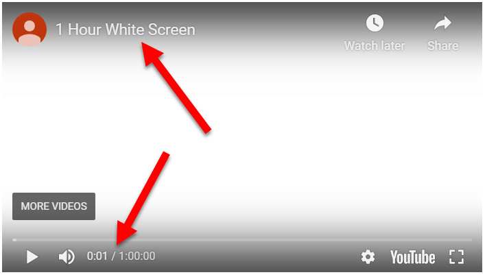
An issue that will impact low vision users, the video title and video time have below a 4.5:1 Colour contrast. The YouTube logo is exempt. Text such as "Watch later" and "Share" are at least accompanied by an icon that is above a 3:1 contrast ratio, passing 1.4.11 Non-text Contrast.
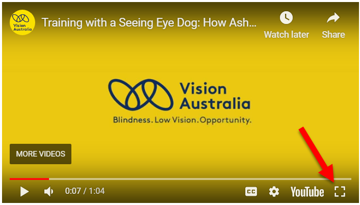
Issue 3: Fullscreen button has no semantic name applied
The fullscreen button for some strange reason doesn't have a semantic name applied, despite other buttons in the YouTube player being labelled appropriately. Like the other buttons, it does have a title attribute, but this title attribute can be ignored by screen readers and curiously the aria-label attribute is absent from this button.
Code used:
……
Issue 4: Single key character shortcuts
The YouTube player makes use of single key character shortcuts. This means pressing a single key on the keyboard can trigger a function of the YouTube player. For example, pressing "K" will pause/play the video.
This can be problematic for accessibility as often assistive technologies such as screen readers make use of those same single key keystrokes. This can cause screen reader users to accidentally activate something related to the video when they were trying to use their screen reader, or vice versa.
Thankfully, the Embedded YouTube player does provide the option to disable the single-key keystrokes, however content authors will need to manually change this as by default the keystrokes are enabled:
"disablekb: Setting the parameter's value to 1 causes the player to not respond to keyboard controls. The default value is 0, which means that keyboard controls are enabled."
Source: YouTube Player Parameters
Other smaller issues
Other WCAG 2.1 level 'AA' failures in the YouTube player include:
- Subscriber count being marked up as a heading when it doesn't need to be.
- NVDA has difficulty reading the "Subscribe" button, you must tab to the button to get NVDA to announce it.
- The Subscription notification bell doesn't announce its state (pressed/not pressed) to screen reader users.
- When the YouTube player has no controls, it can be difficult to figure out how to pause the video when using only a keyboard to navigate, as focus is not entirely clear.
Google Maps
Google maps also has a number of WCAG related issues.
The map itself on Google maps is not accessible for people who are blind, but usually Google maps are embedded for the purpose of showing an address. Blind screen reader users could still use google maps for the purpose of figuring out how long it will take to reach certain destinations.
Issue 1: Poor Focus order
The focus order, or the order that keyboard navigators are sent through when they press the 'tab' key to advance forward through a website, isn't too logical in google maps. The order tends to bounce around quite a bit, starting at the bottom right before bouncing up to the top left and then back to the zoom controls on the bottom right. This focus order can be confusing and hard to follow for keyboard navigators.
Issue 2: Satellite/map button is keyboard inaccessible and has no semantic name
The button that changes the map view to satellite view is not in the focus order at all, making it impossible for keyboard only navigators to focus on the button and activate it.
The satellite button also doesn't have a semantic name applied for screen reader users, making it difficult to perceive for them as well.
Issue 3: Colour contrast of location labels is poor
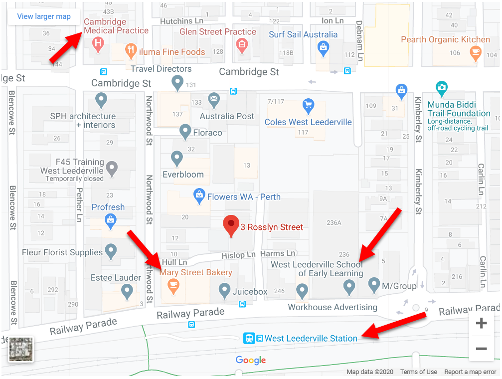
Google maps users a variety of colours to show restaurants, transport and other landmarks on their map. However, the colours that they use don't stand out too well from the background contrast wise, making it difficult for people with low vision to read.
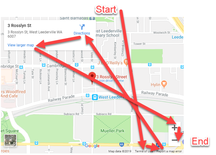
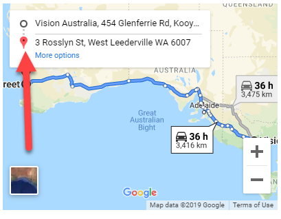
Issue 4: Start/end destination not clear to screen reader users
Along with a single location, you can also embed directions onto your website using google maps. But for screen reader users they can read the location names, but cannot know for sure which location was the start or end as this is communicated via some visual markers only.
Issue 5: Map cannot be panned with keyboard
Another major issue is that the map cannot be panned around using the keyboard. It's possible to zoom in and out with the dedicated "Zoom in" and "Zoom out" buttons, but if you're a keyboard user and want to pan the map around, then you're out of luck.
We have shared a script on our website that you can use to resolve this issue and make it possible for keyboard navigators to pan Google maps using the arrow keys.
Other smaller issues
Other WCAG 2.1 level 'AA' failures in the Google Map component include:
- The rating stars when viewing a restaurant are not announced, only the number, which means the number is presented without context for screen reader users.
- The "Google" logo at the bottom of the Google Map component has no alt attribute provided, some screen readers will announce the filename of the image instead.
It's unfortunate that a company as large as Google would have accessibility issues on their Google map and YouTube player components, but it goes to show that you can't always rely on the large technology giants for good accessibility practice all of the time.
Vision Australia will be reaching out to Google in an attempt to get these issues noticed and hopefully addressed, but in the meantime all organisations can do is wait for things to be made accessible.
Digital Access provides consulting services for designing and testing ICT in the workplace. Contact us to talk about how we can help your project or organisation.
Don’t miss out on the latest news and advice from the Digital Access team. Sign up to their newsletter and have it delivered straight to your inbox.


