


Every time we write something, it is an opportunity to consider typography, from the fonts we choose to the way we style and format text.
By taking an inclusive approach and designing with people with disability at the centre, we can create more accessible typography for everyone.
This blog is the first part of a two-part series exploring typography in Inclusive Design. The series covers:
- The importance of inclusive typography and 8 key tips for accessible typography (Part 1)
- Choosing an accessible typeface and laying out text (Part 2)
Typography in Inclusive Design
View the Typography in Inclusive Design video with Jacinta Oakley – our free lunchtime webinar held on 24th February 2022.
What is typography?
Typography is the art and technique of arranging type to make written language legible, readable and appealing when displayed.
This involves the fonts we choose, how we style them (consider examples like font sizes, font weights, spacing between letters), and how we format text on a page).
This blog series will focus on typography in the digital context.
Why is accessible typography important?
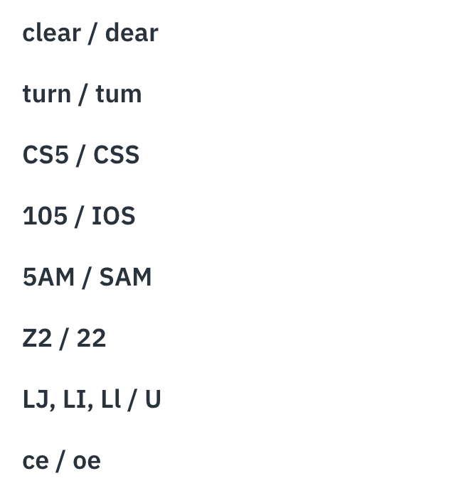
A study by Thomas Bohm of User Design, Illustration and Typesetting London showed that the following letters and symbols confused people aged 13 to 45 who did not identify as having a disability.
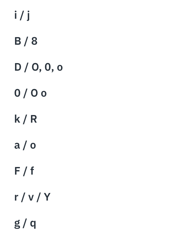
When testing with users with low vision, users with dyslexia and users aged over 45, the range of characters that may be confused increased:
This study highlights the importance of accessible typography. It also demonstrates a clear benefit for all users when we take an inclusive lens and design with people with disability.
Why do I need to know typography?
Every time you write something, it is an opportunity to consider typography. Some key examples of when we create and design text content in our day-to-day are:
- Websites
- Mobile applications
- Emails
- Social media
- Presentations
- Documents viewed and interacted with on screen
- Online content (like intranets and blogs)
- Other digital interfaces (like a payment terminal)
We can all play a role in making the information and communications we produce more accessible.
Accessible content writing
Note, the scope of this blog is discussing how typography is designed visually and formatted. However, it's important that the written content we are producing is accessible and inclusive.
There is a lot to consider when it comes to accessible content writing, and we will not address this topic in detail in this blog. However, the following key considerations and linked resources may be a good starting point:
- Use Plain Language (always)
- Provide Easy English versions (where appropriate)
- Break up content with clear headings and sub-headings
- Use dot points and numbered lists.
Why take an inclusive lens to typography?
What the accessibility guidelines (do and don't) say about typography
Accessibility guidelines are a great starting point for creating accessible text content, but they will only get us to a baseline or minimum standard.
We are talking about the Web Content Accessibility Guidelines (WCAG). They are an internationally recognised benchmark for web content accessibility, with the overall goal of making the web more accessible to people with disabilities. WCAG is frequently revised and updated; the current version is WCAG is 2.1.
Guidelines on text content in WCAG 2.1 address:
- Text contrast: Text has sufficient colour contrast ratio with its background (1.4.3)
- Resizing text: Users can resize text up to 200% without any text being obscured (1.4.4)
- Images of text: Advice on images of text (1.4.5)
- Responsive text: Designing text content to be responsive across platforms (I.e. desktop and mobile devices) (1.4.10)
- Text and line spacing: User ability to change space between letters and lines of (1.4.12)
- Headings: Text should have appropriate heading structure, and all headings should be descriptive and relevant to text content (incl. 1.3.1 and 2.4.6).
However, WCAG 2.1 doesn't have a lot to say about typography itself. For example, it doesn't include detailed advice about things like choosing accessible fonts, specifications for text styling like font sizes and weights or text layout.
We need to go above and beyond the guidelines
Usability testing across a range of projects and contexts at Digital Access has highlighted that inaccessible typography can significantly impact people's ability to read and understand information.
Two key cohorts (or functional groups, as we call them at Digital Access) of people with disability that are most significantly impacted are:
- People with vision disabilities
- People with cognitive and/or learning disabilities.
Impacts of inaccessible typography for people with vision disabilities
When we refer to people with vision disabilities at Digital Access, we generally consider 3 key groups:
- Low vision
- Blindness
- Colour blindness.
Low vision
For people with low vision, individual characters may be difficult to perceive. Text and paragraph formatting can also make text more difficult to read.
Users with low vision will often need to enlarge content on a screen to help them read it. This may be done by:
- Pinching and zooming on a touch screen device, in-browser zoom controls on a computer (I.e. scrolling on a mouse wheel or using 'Ctrl +' and 'Ctlr -' shortcuts on keyboard).
- Using dedicated screen magnifying software (on a phone or computer) that magnifies a portion of the screen and follows the user's mouse or finger.
This means that impacts for screen magnifier users should be front-of-mind when laying out text content.
People who are blind
Somewhat counterintuitively, typography can also impact people who are blind or use assistive technology like screen readers. For example, screen reading software reads aloud on-screen content like websites or documents, and typography can impact how text content is read. This blog series will cover a few key examples of this.
Colour blindness
Colour blindness is a common term often used to describe 'colour vision deficiency. True colour blindness (the inability to see any colour, known as Monochromacy) is very rare. Colour vision deficiency (difficulty perceiving and distinguishing some colours, I.e. Red-green colour vision deficiency) is far more common.
For people with any kind of colour vision deficiency or colour blindness, the colour contrast ratio of text against its background can impact legibility.
Colour contrast is a critical aspect of design that considers all content, not just typography. This blog series will provide some tips and resources for determining accessible colour contrast for text content.
Impacts of inaccessible typography for people with cognitive and/or learning disabilities
Firstly, it's important to acknowledge that this is an extremely diverse functional group encompassing many different disabilities and every person's experiences and needs are unique. At Digital Access, we work with and consider any individuals who identify as neurodiverse. This most commonly includes people with Dyslexia, people with Autism and people with Attention-deficit/hyperactivity disorder (ADHD).
People who are neurodiverse experience differences in neurological development and processing. Based on usability testing conducted at Digital Access, common issues we see with typography are:
- People with dyslexia experience differences in the way the brain recalls and works with letters and sounds
- They may have difficulty recognising letters and words
- Complex design and layout can impact their ability to process written information
- Difficulty when reading text can lead to increased mental load and distraction.
Inaccessible typography can impact user experience for people with a disability and even prevent people from accessing important text content and information.
Ultimately, there is a need to go above and beyond baseline guidelines to make text content accessible for everyone.
Typeface accessibility: what to look for
In order to discuss accessible typography, there are some key terms we should define upfront.
There is a lot of complex terminology in this field of practice, so I will try to avoid jargon terms or explain them when necessary throughout this blog series.
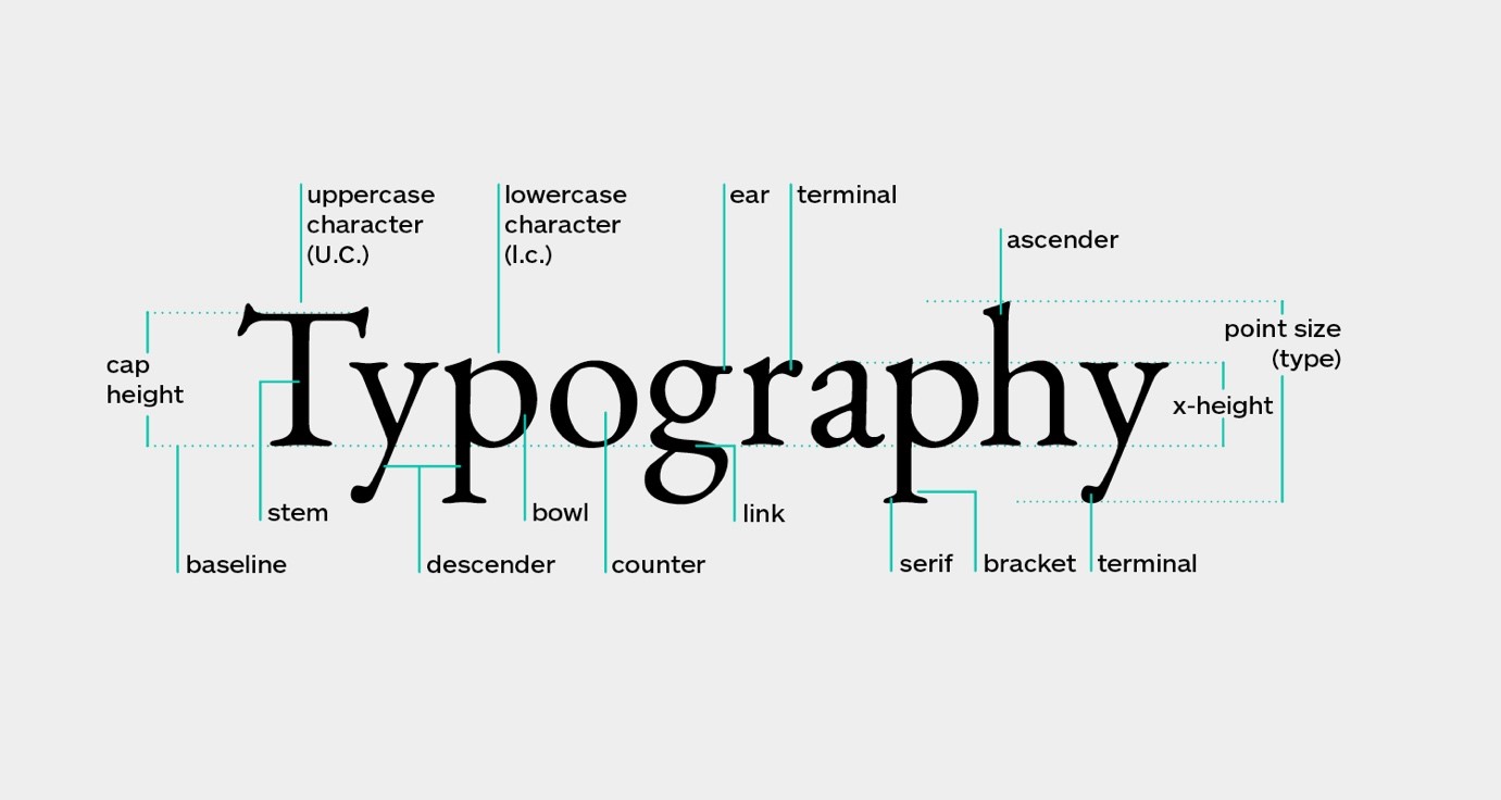
Image source: What is Typography? A Deep Dive Into All Terms And Rules
What do we mean by 'typeface'?
'Font' might be a word you're more accustomed to reading or heading.
The image below shows a number of the most popular fonts. They are actually different variations of the one' typeface' Helvetica, which comes in light, regular, bold, italicised and other font varieties. 'Typeface' is the name for this group of complementary fonts.
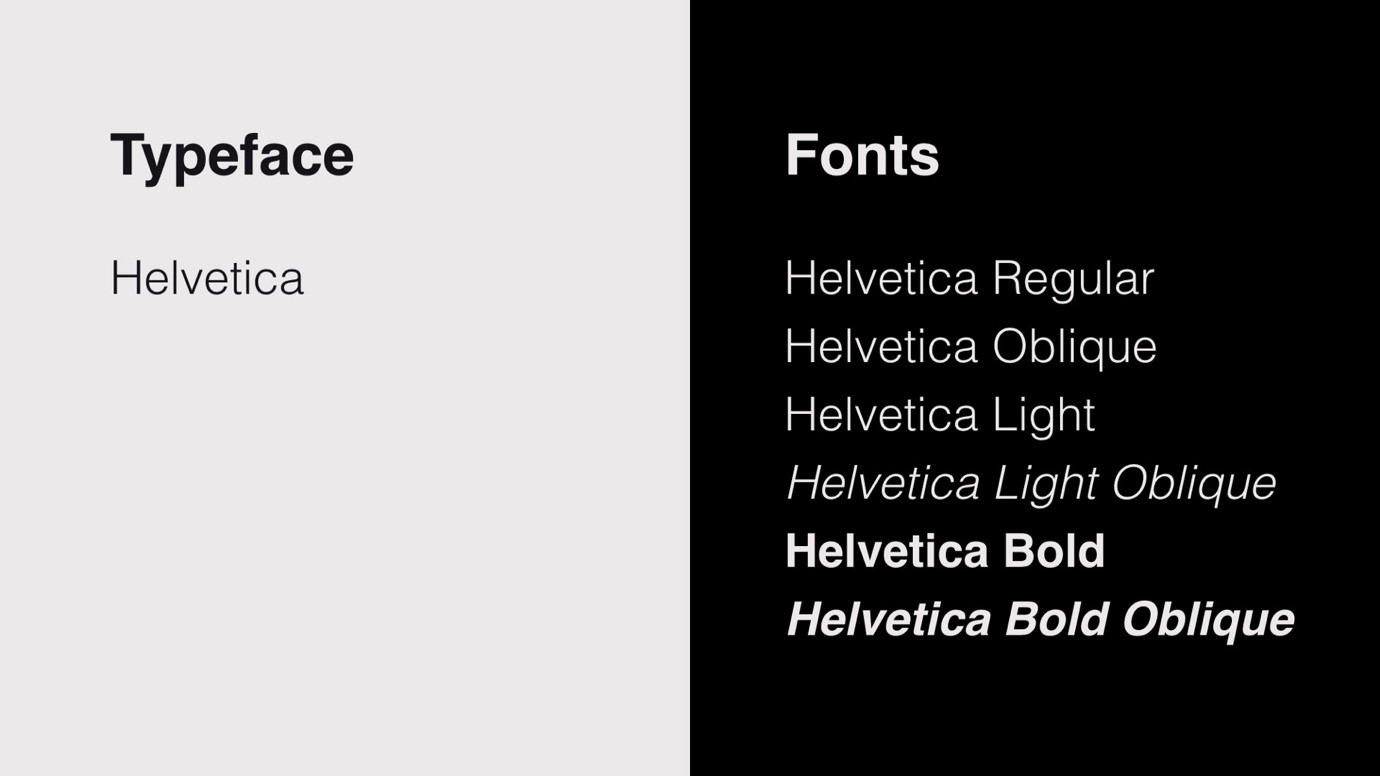
Source: UX Planet: The ultimate guide to choosing fonts
Generally, when you think 'font', you probably think of a typeface, and the terms are often used interchangeably. However, this is a useful distinction that will be explored later in this blog series. For clarity, I'll use the word typeface throughout the series.
Legibility and readability
Any accessible typeface should be 'legible' and 'readable'.
These terms are often used interchangeably; however, they do have nuanced meaning, so I feel they are important to define upfront.
'Legibility' refers to how effectively a person can distinguish individual letters.
'Readability' refers to how effectively a person can read and understand sentences and sustain reading for a period of time. Readability considers factors like effort, ease and comfort when reading.
As discussed above, there are additional barriers to legibility and readability for people with disability that should be considered. Legibility (the ability to distinguish individual letters) should be considered a baseline minimum as it doesn't guarantee people will have a good experience reading and consuming content. We want to aim for readability, where content is engaging, comfortable and easy to read.
8 key tips for accessible typography
An accessible typeface is both legible and readable for people with disability (and, therefore, everyone).
This blog section will provide 8 key tips for identifying whether a typeface is accessible (or not). It will also provide practical steps you can take to make any typeface more accessible.
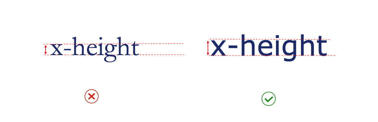
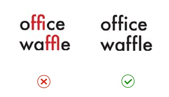
1. Choose typefaces with a taller 'x-height.'
The 'x-height' is measured by the height of the lower-case letter 'x' in a typeface. It is a useful measurement as it tells us the size of the main body of a lower-case letter, excluding the ascenders (like the vertical stroke of a lower case 'd’) and descenders (like the vertical stroke of a lower case ‘p’).
The below image provides an example of two different typefaces (set at the same text size). The typeface shown on the right has a taller x-height and, therefore, larger lower-case letters in proportion to upper-case letters. This makes it more legible.
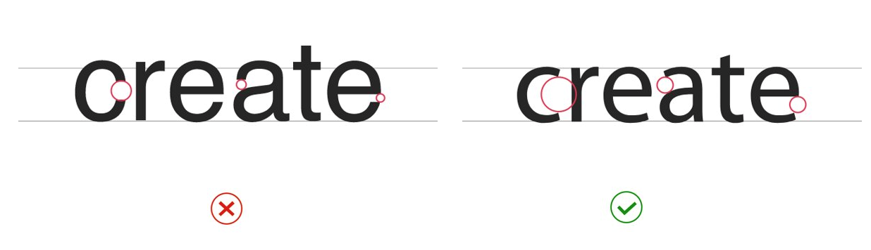
2. Choose more open typefaces
The openings within a letter (like the opening in the curve of the letter ‘c’ or a lower case ‘e’) are known as the ‘aperture’.
Typefaces with more open (or larger) apertures are generally more legible. This helps to give letters more unique shapes.
The below image shows two typefaces (set at the same text size). Red circles are used to highlight the apertures (open spaces on the ‘c’, ‘a’ and ‘e’). The typeface on the right has more open apertures and is easier to read.
3. Choose typefaces with larger white spaces within letters
Like the enclosed or partially enclosed white spaces inside an ‘e’, the white spaces within a letter are called the 'counter space'.
Apertures and counter spaces are closely related. If a typeface has a more open aperture, it is likely also to have larger counter spaces. As demonstrated in the image below, typefaces with larger counter spaces are generally more legible as larger white spaces help readers distinguish letter shapes easily.
4. Choose typefaces without joined letters
When letters are joined together, this is called a 'ligature'. Ligatures can occur between all letters in a word or between only some letters within a word. They are often found in ‘Script’ of handwritten typefaces.
The below image compares a Script typeface that has ligatures to a Cursive typeface that does not have ligatures. Both typefaces have a handwritten style, but the cursive typeface without ligature is more legible.
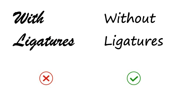
Additionally, this next example shows ligatures between individual letters like an ‘f’ and ‘i’ or ‘f’ and ‘l’. These impact legibility as they are unfamiliar shapes that draw the eye and can be jarring to the readers.
Screen reader software can also struggle to read some typefaces with ligatures depending on the code that sits behind the text. Sometimes these are not read as letters but unfamiliar symbols. Therefore, testing text content with a screen reader is always recommended.
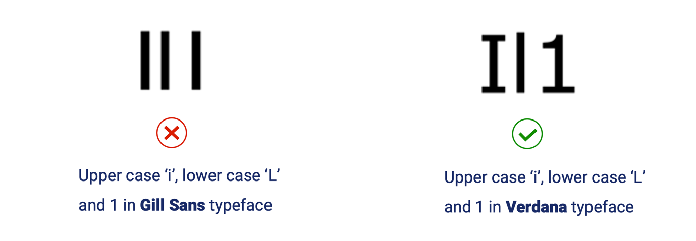
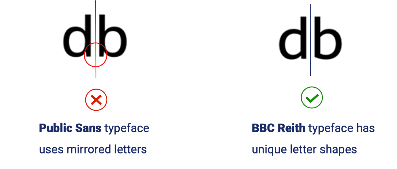
5. Choose typefaces with recognisable characters
Typefaces where letters can easily be mistaken for one another are generally less legible. Two key characteristics to look out for are ‘imposter’ letters and ‘mirroring’ letters. Imposter letters are when one character can be easily mistaken for another. This often occurs with capital ‘i’, lower-case ‘L’ and the number ‘1’. The image below shows Gill Sans's typeface on the left, where these characters are virtually indistinguishable. The typeface Verdana, on the right, is an example of where letter heights and additional strokes ensure the characters are unique.
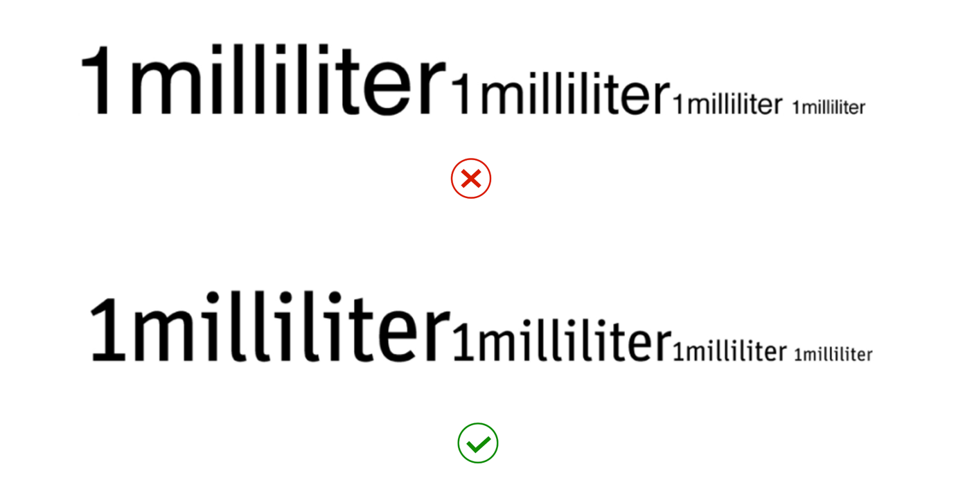
To provide an example in context, the image below demonstrates how the word ‘milliliter’ can be extremely difficult to read at small text sizes when a typeface has imposter letters. The first typeface employs imposter letters making it difficult to distinguish the ‘i’ and ‘l’ at smaller text sizes. The second typeface has unique characters (like a curved bottom of the lower case ‘l’) and is much easier to read at larger and smaller sizes.
Typefaces with mirroring letters should also be avoided. Mirroring letters occur commonly in characters like a lower-case ‘d’ and ‘b’ or ‘q’ and ‘p’. When these are exact mirror images of one another, readers can easily confuse them. For example, the image below shows a typeface that employs mirroring on the left and one with unique characters on the right. Therefore, typefaces that use unique letter shapes and don’t employ mirroring are considered more accessible.
6. Look at the spacing between letters
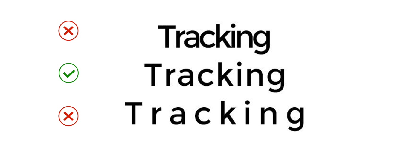
The spaces between letters in a word can impact legibility. This is called ' tracking' when we adjust the horizontal spacing between all letters in a word or section of text. This is called ' kerning' when we only adjust the horizontal spacing between two adjacent letters.
When letters are too close together (tracking is too ‘tight’), letters may touch one another, making them difficult to distinguish.
When letters are too far apart from one another (tracking is too ‘loose’), words can lose their recognisable shapes and spaces between words can be more difficult to identify.
The image below demonstrates tight, optimal and loose tracking.
Don’t forget to look at the space between individual letters (kerning) because larger white spaces between two letters in a word can distract readers. If two letters in a word are touching, this can also cause distraction or make an individual character more difficult to recognise. Keep an eye out for letters that take up more space because they create challenges when next to other upper or lower-case letters. Diagonal sided uppercase letters (A, W, Y) are the most problematic, but so are letters that have larger arms (F) or crossbars (T). The most common letter combinations that need kerning at larger sizes are: AW, VA, Fa, LV, Wa, AD and AT. But that doesn’t mean that lower-case letters don’t require just as much attention as uppercase letters can.
The image below highlights the difference appropriate kerning makes to readability (removing distracting white spaces), using the word ‘AVAIL’ as an example.
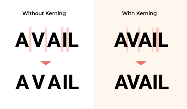
Source: Creatopy, The art of kerning typography: 10 tips for kerning like a pro.
It is difficult to provide prescriptive guidelines or metrics for ideal tracking and kerning as it varies based on factors like the typeface used, type size and weight, and the context it is used in.
For example, if text is displayed on a screen for viewing at a distance, looser tracking (more space between letters) will aid legibility.
WCAG 2.1 (1.4.12) requires that users are able to adjust tracking to at least 0.12 times the font size and adjust word spacing to at least 0.16 times the font size. The website does not require this built-in functionality but should not block programs that allow users to customise text content in this way. No specifications for default tracking are provided.
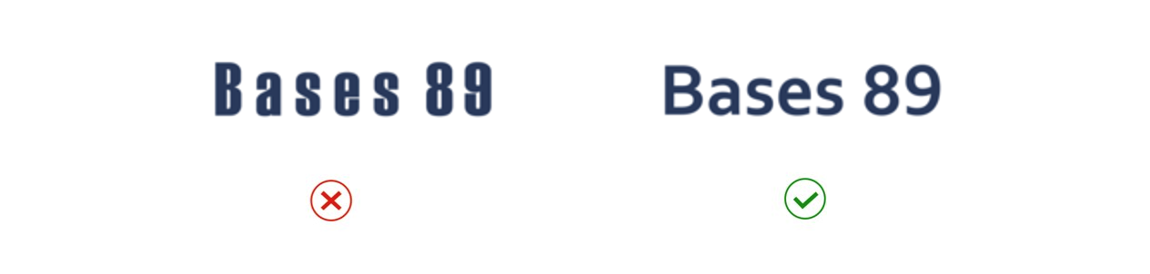
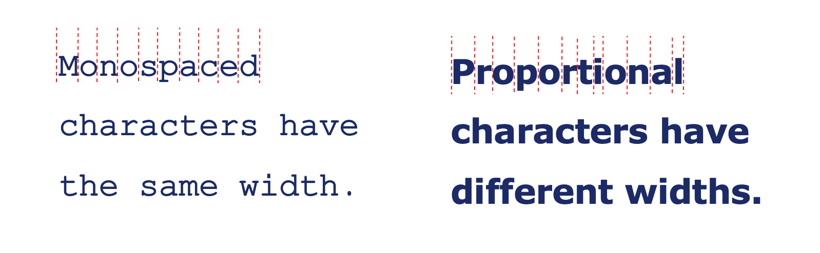
Look for proportionate, not monospaced typefaces:
When selecting a typeface, look for typefaces with proportionate letters spacing (that varies according to the size of the character). We generally recommend avoiding monospaced typefaces (uniform letter size and spacing), as these can be more difficult to read for long passages. The below image compares an example of a monospaced typeface with a proportionate typeface.
Most proportionately spaced typefaces have appropriate default tracking that changes according to the text size; however, some have naturally ‘tighter’ or ‘looser’ letter spacing. If you use common typefaces in programs like Microsoft Word, you will generally not need to adjust tracking or kerning as the presets will be appropriate.
We suggest avoiding using less common ‘display’ or ‘decorative’ typefaces as they are more likely to pose accessibility issues, including that the default tracking is less likely to be appropriate.
Visually assessing appropriate, proportional white space between letters (and adjusting where necessary) is key.
How can I adjust letter spacing?
This article provides instructions on adjusting the spacing between characters in Microsoft Word.
For designers producing static digital content in programs such as Adobe InDesign, there is great flexibility to customise and letter-spacing:
- This article provides instructions on tracking and kerning in InDesign.
- This article ‘What is Kerning? Everything You Need To Know’ provides comprehensive advice about kerning in InDesign.
This article discusses considerations for applying letter spacing to text on the web.
7. Limit the use of ALL CAPS text
Consider avoiding or limiting the use of ALL CAPS text.
When reading, we recognise letters and words based on their shape. Unfortunately, words in ALL CAPS are uniform and rectangular, making them more difficult to read, particularly for long sections of text.
If ALL CAPS text must be used (I.e. for a logo or short heading), ensuring there is ample spacing between letters can help provide some shape to words and improve readability.
The below highlights the impact on unique word shapes when set in ALL CAPS, compared to Sentence Case.
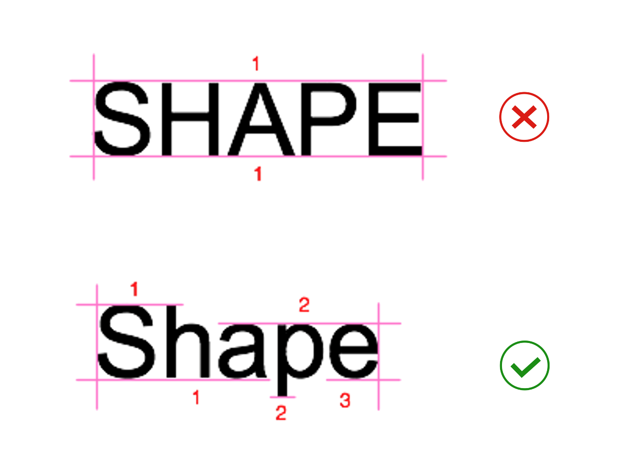
Source: UX Planet: Why letter casing is important to consider during design decisions.
Text in ALL CAPS can also be read incorrectly by screen reading software. Screen readers will generally interpret text in ALL CAPS as an acronym if it can be read as one. An example of this can be problematic is ‘CONTACT US’, in ALL CAPS will be read as ‘Contact U.S’.
8. Avoid images of text
Avoiding or limiting the use of images of text is highly recommended. When users with low vision zoom in to view content, images of text can become pixelated and often illegible. Images of text are also inaccessible to screen reader users unless the appropriate alternative text is applied to the image.
The below image offers an example of how images of text become more pixelated and difficult to read as the zoom level increases.
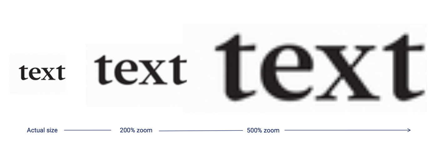
When images of text must be used (for example, a logo), consider using a high-resolution image to avoid pixelation when enlarged and applying alternative text that includes the written content.
Summary
In summary, our 8 key tips for accessible typography are:
- Choose typefaces with a taller ‘x-height.’
- Choose more open typefaces
- Choose typefaces with larger white spaces
- Choose typefaces without joined letters
- Choose typefaces with recognisable characters
- Look at the spacing between letters
- Limit the use of ALL CAPS text
- Avoid images of text
We hope these tips will provide a useful starting point for designing more accessible typography.
However, testing text content with people with disability in context to ensure it is accessible and inclusive is always recommended.
Look for the next instalment of the Typography in Inclusive Design blog series coming soon, which will discuss:
- How to put the ‘8 tips for accessible typography’ into practice when choosing and styling typefaces
- Some common typefaces that are considered more accessible (and why)
- Advice for formatting and laying out text content accessibly.